When AI makes your slides too real
The paramedic on the screen has a glow.
Not sweat. Not stage light. Something under the skin, orange-red, like a Ready Brek advert built by someone with better software than Weetabix ever had.
The speaker is talking about cognitive overload during resuscitation. The flood of information a clinician has to filter in the worst four minutes of someone's life.
Every slide behind them is doing the opposite of what the words are asking for.
I lean forward. Not because I'm gripped. Because I want to know how they made that glow.
The next slide has one too. So does the one after that.
By the third slide, I clock it. More grain each time. More contrast. Shadows a little deeper than the last slide's shadows, like someone found a filter marked "gritty" and kept nudging it up.
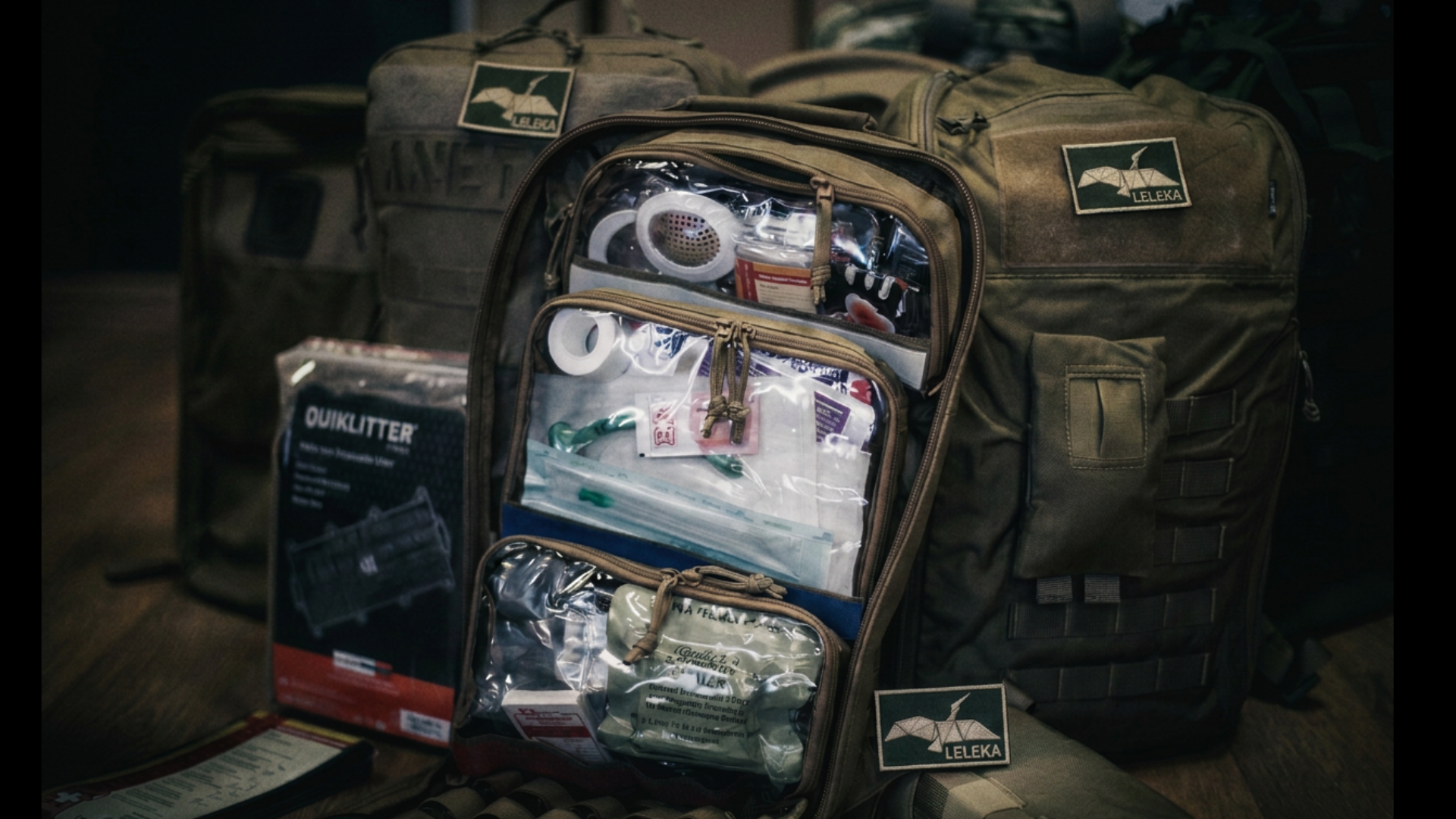
Then the kit bag.
Every zip, every scuff, every fold of nylon, rendered in a kind of detail no camera in a real ambulance bay has ever caught.
I stop listening. I start looking.
Not at the paramedic. At the bag.
💡 ONE IDEA WELL
I don't know how long I stare at the bag.
Long enough that when I look back to the speaker's face, I've missed a full sentence, maybe two.
This is the part nobody warns you about with AI images. Not that they look fake. That they look almost real, and your brain won't let the "almost" go.
There's a name for the feeling: the uncanny valley.*
But naming it is too clean for what it actually felt like, watching this.
It felt more like watching one of those live-action remakes of a Disney classic. Every frame hyper-real, every texture done to death, and somewhere in all that fidelity, the thing that made the cartoon lovable in the first place goes missing.
You spend the whole film watching the render, not the story.
Except this wasn't a film about a lion cub. This was resuscitation. A paramedic's worst four minutes, wrapped in the visual grammar of a Netflix trailer.
Watching it, I felt uncomfortable in a way I didn't expect. A little like trauma-porn. A little dirty, if I'm honest, sitting in a room full of clinicians, watching a crisis rendered in cinematic detail for our viewing pleasure.
And here's the part that makes it worse to say out loud: the talk itself was excellent.
The speaker knew their content, knew their audience, built an argument that held together. They just didn't need any of it. Every insight they were making about cognitive overload was fighting the cognitive overload happening on the screen behind them.
🧰 LESS MESS, MORE MESSAGE
Here's the reframe: this was never really about AI.
AI is just the newest, easiest way to manufacture the thing slides have always been at risk of becoming, which is louder than the point you are making.
There's research on why the kit bag did what it did to my attention.
Near-human, hyper-real images take more processing to make sense of than either a real photo or an obvious cartoon. Your brain has to work out what it's looking at before it can work out what it means. That extra work is the eeriness.*
It isn't a mood, it's a cost, paid in the same currency your audience needs to follow your argument.
Research on presentation design says the same unglamorous point: photos that are emotive, distracting, or purely decorative reduce how much of the actual content people remember.
Not because the image was ugly. Because it was busy, and busy competes.
So the paramedic's slide wasn't a style choice. It was a tax on the exact thing the talk was trying to protect. The speaker was asking their audience to understand cognitive overload while quietly overloading them.
🧭 TRY THIS
Here's the test I use now, for what it's worth.
Before I let AI touch an image, I ask one question: is this fixing something, or is it making something?
Fixing is fine. More than fine, in fact.
Last week, at a workshop, I had a photo of Kurt Vonnegut, cropped tight, one knee cut off at a hard, ugly edge. I used AI to grow the knee back. Nobody in the audience would ever have known the knee was invented. Nobody needed to know. The photo just looked like a photo again.
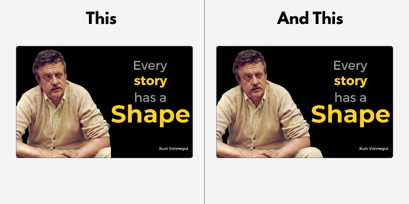
Time to play spot the difference.
The kit bag never got that treatment.
Using it was not fixing a flaw. It was creating a spectacle, and spectacle has a habit of hogging the limelight. A glow that was never on that paramedic. A kit bag with more detail than the actual kit bag on the actual ambulance.
So: fix the shadow, straighten the wire, grow back the knee. Don't build the scene. If you wouldn't trust the image to survive someone standing three feet from the screen, staring at it the way I stared at that bag, it doesn't belong on the slide.
Speak soon,
Andy
Know a colleague with a talk coming up? Forward this to them.
PS — I've got opinions about whether that talk needed slides at all. That's a fight for another issue.
Cheetham, M., Suter, P., & Jäncke, L. (2011). The human likeness dimension of the 'uncanny valley hypothesis': behavioral and fMRI findings. Frontiers in Human Neuroscience, 5, 126. https://doi.org/10.3389/fnhum.2011.00126
Pink, A., & Newton, P. M. (2020). Decorative animations impair recall and are a source of extraneous cognitive load. Advances in Physiology Education, 44(3), 376–382. https://doi.org/10.1152/advan.00102.2019